Create basic facets chart
What are Facets Charts?
Facets are “one side of something many-sided”. In ggplot2 Facet charts are subplots that plot the dataset based on categorical variable’s levels.
Facet charts are very useful when working with a categorical variable.
But these are not practical when the categorical variable has too many levels. At that point, it is better to use colors for each level, find more about it here .
Procedure
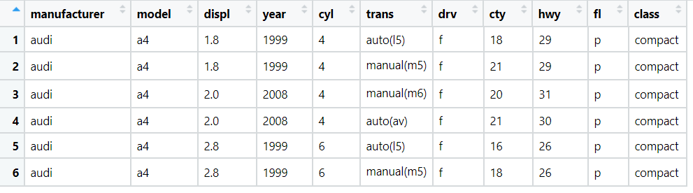
We will be working with the MPG data set present in-built in ggplot2. Few of the rows of the dataset are as follows:
We have already looked at creating a basic scatterplot here. We plotted the car’s engine displacement (displ) with the fuel efficiency (hwy) variable.
Additionally if we wanted to visualize the displacement of the car and the fuel efficiency based on the class of the car, we can use facets chart for this.
Note: The unique levels of the class variable are:
library(ggplot2)
unique(mpg$class)- “compact”
- “midsize”
- “suv”
- “2seater”
- “minivan”
- “pickup”
- “subcompact”
Code
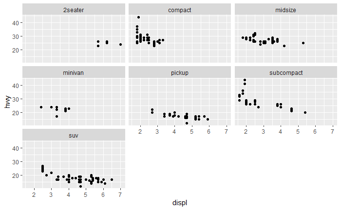
The code below creates a basic facets chart. Here we use the facet_wrap(…) function, where we specify the categorical variable on which we want to facet. ‘class’ is our selected variable.
library(ggplot2)
# here we facet on single categorical variable
ggplot(data = mpg) + geom_point(mapping = aes(x = displ, y = hwy)) + facet_wrap(~ class)
And the output of above code is:
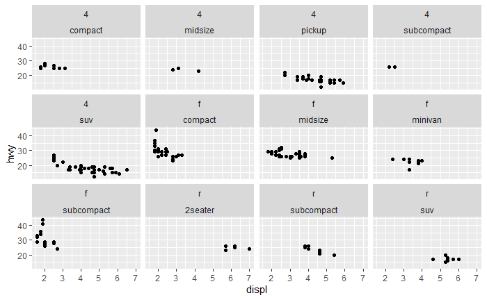
We can also facet on multiple categorical variables, but facet_wrap(..) is best suited for single categorical variable, since it utilizes the space efficiently.
library(ggplot2)

# here we facet on multiple categorical variable
# drv is the type of drive train, where f = front-wheel drive, r = rear wheel drive, 4 = 4wd
ggplot(data = mpg) + geom_point(mapping = aes(x = displ, y = hwy)) + facet_wrap(drv ~ class)
The output of code is:
It is better to use facet_grid(…) when we want to plot multiple categorical variables using facet charts.
Conclusion
Thus we have successfully created basic facet chart using ggplot2.