Flip the Graph Axes
Introduction
The default coordinate system is the Cartesian coordinate system where the x and y position act independently to find the location of each point. We can flip the x-axis and y-axis to create a more comprehendible chart.
Procedure
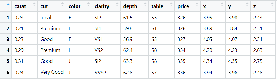
We will be working with the diamonds data set present in-built in ggplot2. Few of the rows of the dataset are as follows:
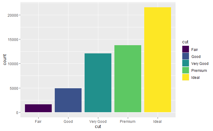
We have already looked at creating a basic bar chart here. We created bar chart using the cut variable. We will now create horizontal bar chart using same variable by flipping the x-axis and y-axis.
Code
library(ggplot2)
# bar chart
ggplot(data = ggplot2::diamonds) + geom_bar(mapping = aes(x = cut, fill=cut))
The output of code is:
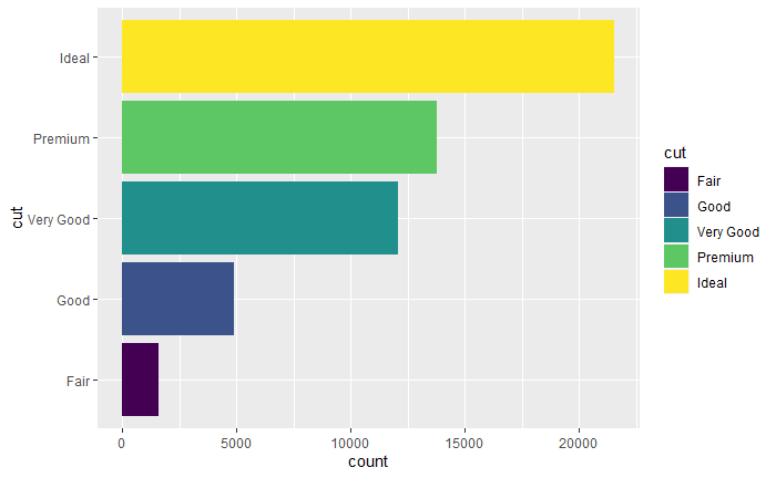
library(ggplot2)
# horizontal bar chart by flipping x-axis and y-axis
ggplot(data = ggplot2::diamonds) + geom_bar(mapping = aes(x = cut, fill=cut)) + coord_flip()
The output of code is:
Conclusion
Thus we have successfully flipped the x-axis and y-axis.
References
- https://r4ds.had.co.nz/