Create basic bar graph
Introduction
Bar Graphs are the most common graphs and thus should be used to explain data. Bar graphs in ggplot2 are created using the geom_bar(…) function. We will create a basic bar graph using grammar of language for ggplot2.
Procedure
ggplot2 has the following basic formula :
ggplot(data = <DATA>) + <GEOM_FUNCTION>(mapping = aes(<MAPPINGS>))
where,
<DATA> is our dataframe. A dataframe is a rectangular collection of variables (in the columns) and observations (in the rows).
<GEOM_FUNCTION> is the type of plot we want to display. All possible types of plots we can create can be viewed here. Since we are creating bar graph the geom function is geom_bar.
Note: We can add more components to the graph using the ‘+’ operator. Learn more about it here
<MAPPINGS> is where we specify the X axis data, Y axis data, color, etc.
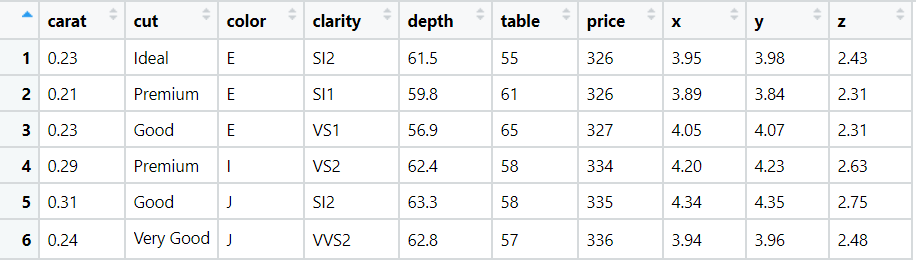
We will be working with the ggplot2::diamonds dataset, few rows of the data are:
We will create basic bar graph which shows the count for each category of diamond cut.
Thus our <DATA> is ggplot2::diamonds and <GEOM_FUNCTION> is geom_bar since we are creating bar graphs and <MAPPINGS> is aes(x=cut) where we specify the x axis data as cut of the diamond.
Code
library(ggplot2)
# create basic bar chart
ggplot(data = diamonds) + geom_bar(mapping = aes(x = cut))
And the output of above code is:
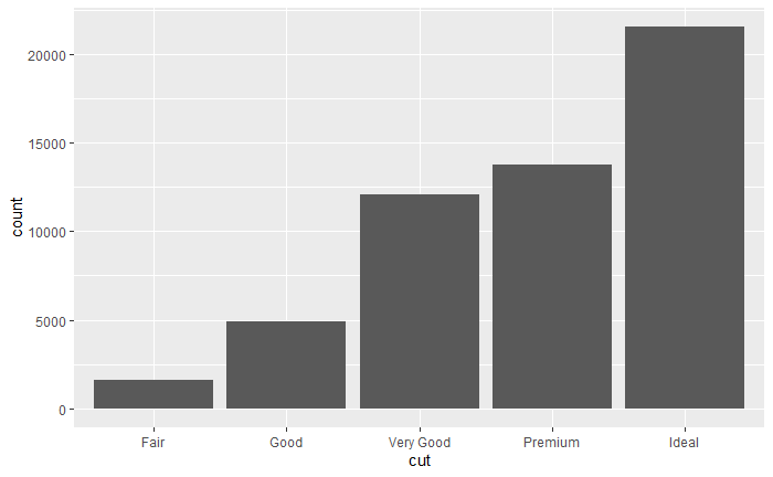
The x axis contains the category and the y axis contains the count of each category. If we want to create bar graphs from absolute values i.e. we explicitly specify the height of the graph refer here.
Conclusion
Thus we have successfully created basic bar chart.
References
- https://r4ds.had.co.nz/