Create basic chart with multiple graphs
Introduction
If we want to plot a bar graph and line graph on same chart we can create them easily with ggplot2. ggplot2 supports multiple graph elements on the same chart.
Each graphing element like bar graph, scatterplot graph, line graph are called geometric objects or in short geoms in ggplot2.
What are geoms? A geom is the geometric object that a plot uses to represent data. We can use different geoms to plot the same data with little modifications.
What are the available geoms?
| Type of Graph | geom to use |
|---|---|
| Scatter plot | geom_point(..) |
| Jitter plot | geom_jitter(..) |
| line plot | geom_smooth(..) |
| horizontal line | geom_hline(..) |
| vertical line | geom_vline(..) |
| diagonal line | geom_abline(..) |
… check the complete list here
Procedure
We can create a stacked layer of multiple graphs by “adding” layers to the chart. We do this by using the + symbol.
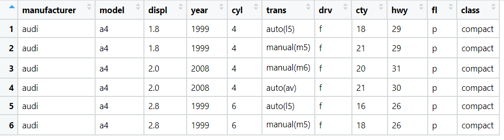
We will be working with the MPG data set present in-built in ggplot2. Few of the rows of the dataset are as follows:
We will create scatterplot and line graph of displ vs hwy variables in same chart, and code for that is below:
Code
library(ggplot2)
# multiple geoms in same plot
ggplot(data = mpg) + geom_point(mapping = aes(x = displ, y = hwy)) + geom_smooth(mapping = aes(x = displ, y = hwy))
The output is:
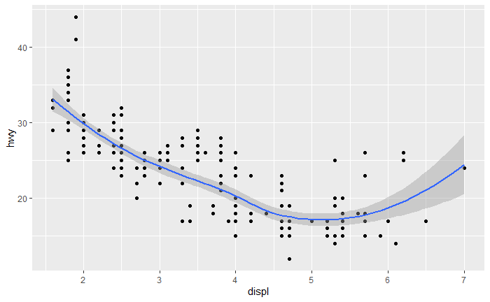
Note: We created multiple charts by using the “+” symbol and we have specified the mapping in each geom function, if we want to specify the mapping once refer global data.
Conclusion
Thus we have successfully created multiple graphs on same chart.
References
- https://ggplot2.tidyverse.org/reference/#section-geoms
- https://r4ds.had.co.nz/